Craig Builders wanted to update their aging website to something more mobile-friendly and professional. They also wanted to increase website conversions and improve the SEO of their home listing pages.
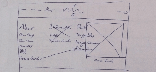
Design Process
I began the project by breaking down Craig Builders’ goals into specific requirements:
1. SEO-Friendly Home Listing Pages
This meant human readable URLs on their home listing pages, as well as the ability to customize SEO metadata on those pages.
2. Professional & Mobile-Friendly Design
This meant using typography, a refined color palette, and beautiful images to convey to users the same feeling online that they would get walking through a Craig Builders home in person.
3. Increased Conversions
This meant making it as frictionless as possible for a user to convert through a form on the site and become a lead.
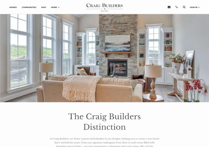
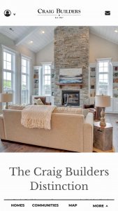
Style
I wanted the site to look minimal and modern, while evoking the elegant, spacious feeling of a Craig Builders home.
Ample white space with large pictures
To accomplish this I used a refined serif typeface for the body copy and headings (Libre Baskerville) and a bold sans-serif (Montserrat) to clearly differentiate buttons and navigation elements.
Large images surrounded by ample white space conveyed the wide-open feel of one of their homes.
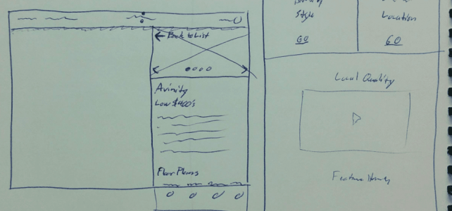
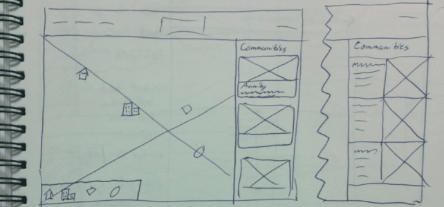
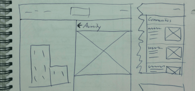
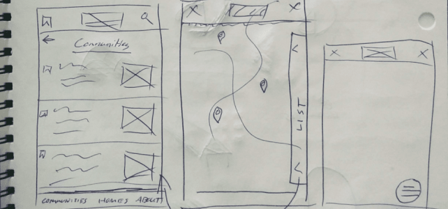
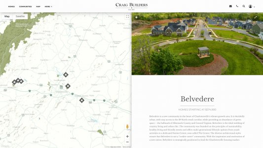
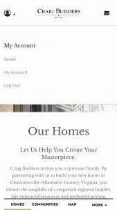
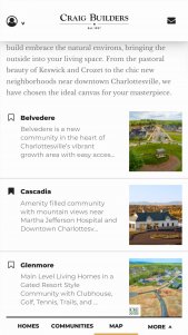
Home Listings
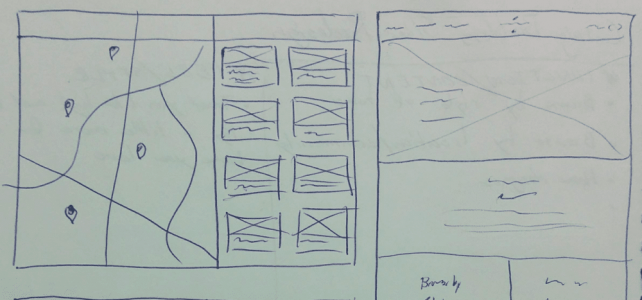
Improving the functionality around retrieving and displaying listings from an MLS (multiple listing service) was going to be an essential part of this project.
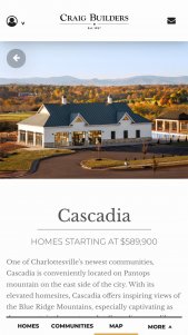
Sorting and filtering home listings
Previously, the Craig Builders site checked the MLS for every page request, and retrieved listings based on an MLS number appended to the URL as a query string. This meant that pages took a long time to load, and that the URL wasn’t very human readable.
My solution to these problems was to batch requests to the MLS twice per day via a cron job, and dynamically populate and publish actual WordPress posts based on the MLS data. If a listing got sold and taken down from the MLS, the corresponding post would be unpublished.
This solution meant that the URL for any listing could be fully customized (we decided to use the home’s address for the URL by default), and that page caching could be enabled across the site to facilitate fast page loads. It also meant that listings could be seen and crawled by bots, as well as added to the sitemap. Lastly, it allowed for easy sorting and filtering of the listings based on their metadata.
Conversions
Making it simple for users to get in touch with the right customer representative as easily as possible was a primary goal for the site. On every home plan, home listing, and community page on the site, I included a simple form for users to enter their email to get in touch with a representative. The form would then send an email to the customer rep associated with that community or home that included the user email as well as the page they filled out the form on.
This has had the effect of increasing leads from the site significantly, particularly from mobile users.
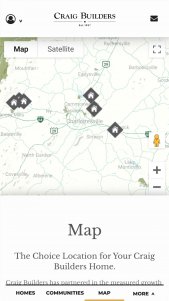
Mobile design
Mobile
It was important that the site worked just as well on mobile as it did on desktop. Craig Builders’ previous website did not work well on mobile and they got the majority of their views from desktop. They wanted to prioritize mobile and bring in a younger customer-base.
It’s a pet peeve of mine when sites offer limited functionality on mobile, and as such I make sure that all my sites have the same functionality whatever device you’re visiting them on. It’s also important for usability and menu discoverability that as many navigational elements can remain exposed as possible across screen sizes. To achieve this goal I used a bottom bar for the primary navigation on mobile. This meant that most of the navigation never had to be hidden behind a tap or a click. This is in contrast to the typical design pattern of hiding the navigation of a site behind a tap on a hamburger menu on mobile.
Results
Ultimately, the redesign was success. The percentage of people visiting and remaining on the site from mobile devices increased after the redesign, and the number of leads they get from their site has increased as well.
Most importantly, they’ve gotten many comments from their customers complimenting the new design, which is just about the best thing you can ever hear as a designer.


